반응형
예제 준비
HTML
<!DOCTYPE html>
<html lang="ko">

<head>
  <meta charset="UTF-8">
  <meta http-equiv="X-UA-Compatible" content="IE=edge">
  <meta name="viewport" content="width=device-width, initial-scale=1.0">
  <title>Document</title>
  <!-- 크로스브라우저 이용시 문제가 될수 있는 CSS 스타일을 초기화 -->
  <link rel="stylesheet" href="https://cdn.jsdelivr.net/npm/reset-css@5.0.1/reset.min.css">
  <link rel="stylesheet" href="./css/main.css">
  <link rel="stylesheet" href="./css/box.css">

  <script defer src="./main.js"></script>
</head>

<body>
  <div class="box"></div>
  <input type="text">
</body>

</html>
CSS
.box {
  width: 100px;
  height: 100px;
  background-color: orange;
  transition: 1s;  // 속성을 서서히 변화시키는 속성
}
ABC:hover : 선택자 ABC 요소에 마우스 커서가 올라가 있는 동안 선택.
.box:hover {
  width: 300px;
  background-color: royalblue;
}
ABC:active : 선택자 ABC 요소에 마우스를 클릭하고 있는 동안 선택
.box:active {
  width: 300px;
  background-color: royalblue;
}
ABC:focus : 선택자 ABC 요소가 포커스되면 선택
input:focus{
  background-color: orange;
}
tabindex 속성을 통해 Focus가 될 수 있는 요소를 만들 수 있다.
이름에서도 알 수 있듯, Tab 키를 사용해 Focus 할 수 있는 순서를 지정하는 속성이다.
순서(값)로 -1이 아닌 다른 값을 넣는 것은 논리적 흐름을 방해하기 때문에 권장하지 않는다.
<div class="box" tabindex="-1"></div>.box:focus {
width: 300px;
background-color: royalblue;
}
ABC:first-child : 선택자 ABC가 형제 요소 중 첫째라면 선택
.fruits span:first-child {
  color: red;
}
ABC:last-child : 선택자 ABC가 형제 요소 중 막내라면 선택
.fruits h3:last-child {
  color: red;
}
ABC:nth-child(n) : 선택자 ABC가 형제 요소 중 (n)째라면 선택.
.fruits *:ntn-child(2n) {
  color: blue;
}
n은 0부터 시작
ABC:not(XYZ) : 선택자 XYZ가 아닌 ABC 요소 선택
.fruits *:not(span){
color: red;
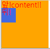
}ABC::before : 선택자 ABC 요소의 내부 앞에 내용(content)을 삽입(인라인 글자 요소)
.box::before{
  content: "앞!";  //반드시 선언
}
ABC::after : 선택자 ABC 요소의 내부 뒤에 내용(content)을 삽입
.box::after{
  content: "뒤!";
  display: block;
  height: 30px;
  width: 30px;
  background-color: royalblue;
}
반응형
'프론트엔드 > CSS' 카테고리의 다른 글
| CSS 상속 (0) | 2021.04.13 |
|---|---|
| 속성 선택자 (0) | 2021.04.13 |
| 기본 선택자 (0) | 2021.04.12 |
| CSS 선언 방식(link, import) (0) | 2021.04.11 |
| iframe 높이 자동 조절 참고 (0) | 2021.04.11 |

